

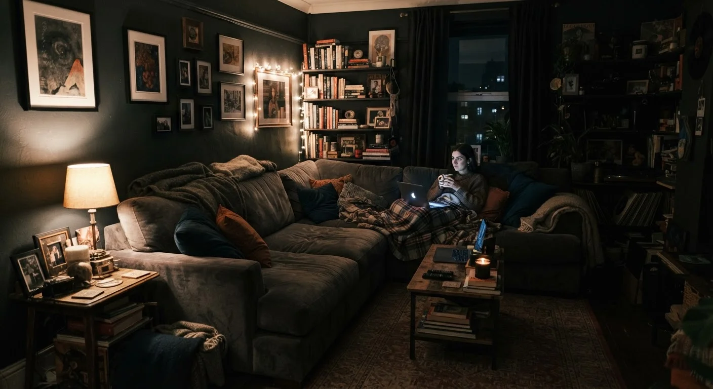
Why Your Room Reads Smaller Than Its Measurements Say
Square footage tells you how much space you have. Design tells you how much space you feel. A well-proportioned room of 200 square feet can feel more generous than a poorly arranged 350-square-foot one, because the human eye doesn't measure — it reads cues. Furniture scale, light distribution, sightlines, and colour all contribute to a mental map of space that may bear little resemblance to reality.
The good news is that most of the forces making a room feel smaller are correctable without structural work. Understanding the specific mistakes that compress space visually is the first step toward addressing them. To understand the underlying principles at work, it's worth exploring the core design principles that make any room feel cohesive.
Common Mistakes That Visually Shrink a Room
The mistakes below are among the most frequent spatial errors found in otherwise well-intentioned interiors. Each one interrupts the eye's ability to move freely through a space — and each has a practical remedy.
Choosing furniture that's too large for the room's footprint.
Why it happens: Homeowners often buy statement pieces in showrooms without accounting for how they'll read in their actual space. A sofa that looks proportionate in a warehouse-sized store can overwhelm a modest living room entirely.
Painting all four walls in a dark or saturated colour without considering light sources.
Why it happens: Dark accent walls have become a popular design trend, and it's easy to extend that logic to the whole room. But deep, saturated hues absorb light rather than reflect it, causing walls to visually advance toward the center.
Using a rug that's undersized for the seating arrangement.
Why it happens: Smaller rugs are often more affordable and easier to manoeuvre, leading many homeowners to choose them by default. However, a rug that sits only under a coffee table — with furniture legs floating off it — visually fragments the room.
Blocking natural light with heavy window treatments or poorly placed furniture.
Why it happens: Privacy concerns often drive homeowners toward thick drapes, and furniture placement tends to follow convenience rather than light flow. Both choices cut off the spatial expansion that natural light provides.
Treating ceiling height as fixed when decorating.
Why it happens: Ceilings feel like a structural given, so most homeowners focus exclusively on walls and floors. But vertical design elements — or the absence of them — have an enormous effect on perceived height.
Allowing visual clutter to accumulate without a clear editing strategy.
Why it happens: Objects accumulate gradually, and each addition seems reasonable in isolation. Over time, surfaces fill up and sightlines become interrupted, which the brain reads as spatial compression even when the room is the same size.
Once you've identified and corrected these issues, consider how furniture placement can further unlock the potential of a room. Furniture arrangements designed for small spaces offer layouts that prioritize openness and function simultaneously.
Scale Matters More Than Size
A room doesn't need to be physically larger to feel more open — it needs design choices that work with the eye rather than against it. Even modest adjustments to furniture scale, colour, and light distribution can create a measurable shift in how spacious a space feels. Before investing in renovation, assess whether your current layout is working against you.
Putting It Into Practice
Spatial perception is rarely the result of one single problem. More often, it's a combination of choices — an undersized rug paired with heavy drapes and a bulky sectional — that together signal confinement to the eye. Correcting one element helps; correcting several in concert produces a noticeably different room.
30–36 in
Minimum clear pathway between furniture pieces
Interior designers broadly recommend this clearance to maintain a sense of open flow and safe circulation in living spaces.
~10%
Perceived size gain from lighter wall colours
Research in environmental psychology suggests that rooms with light-reflective wall tones are generally perceived as larger than identically sized rooms with darker finishes.
A useful starting point is treating the room as a system rather than a collection of individual decisions. Light, colour, furniture scale, and sightlines interact. When they work together, even modest rooms gain a sense of ease and openness that goes well beyond what any single fix could achieve. If you're considering open shelving as part of your solution, be aware that open shelving comes with real trade-offs that are worth understanding before committing.
The content on this site is for informational purposes only and is not a substitute for professional advice. Always consult a qualified professional for guidance specific to your situation.