

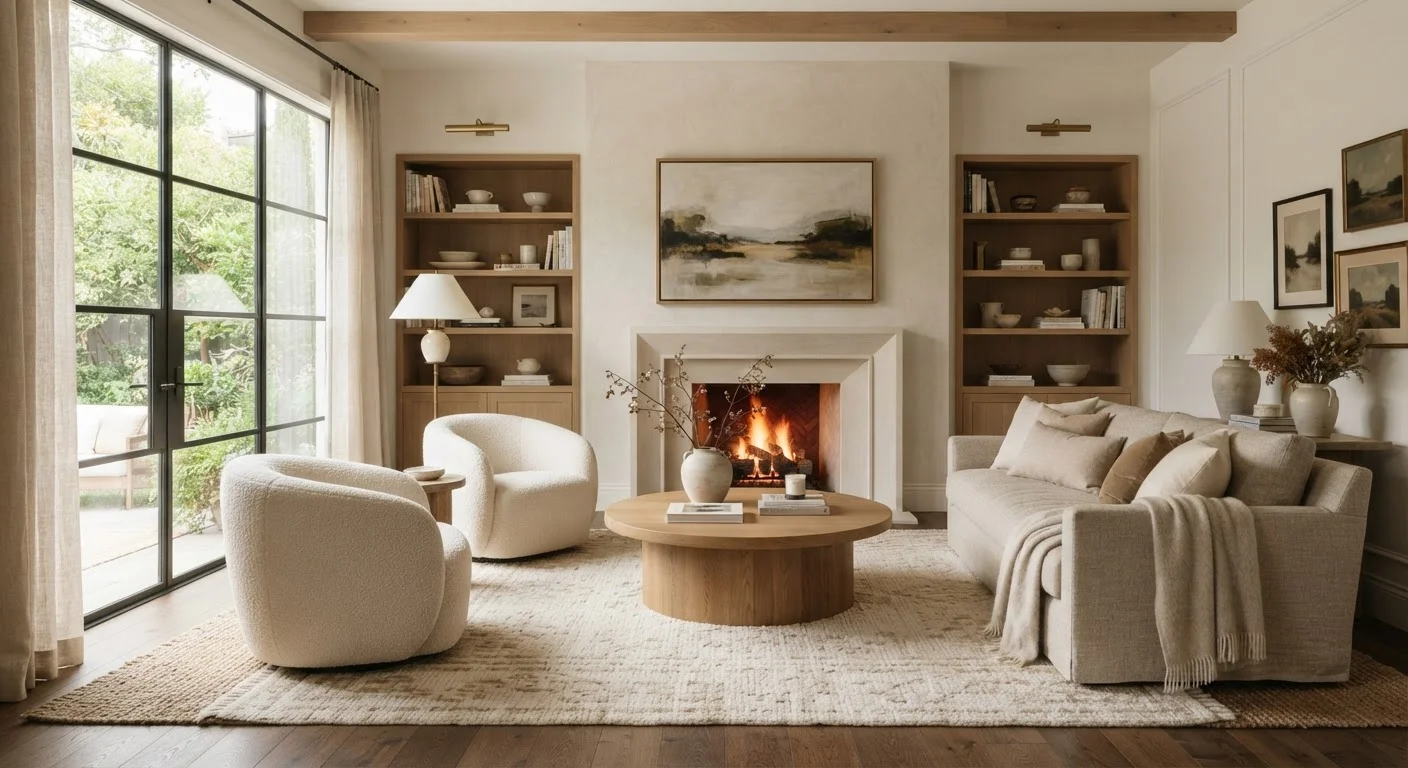
Scale and Proportion: Getting the Size Relationship Right
Scale refers to how the size of an object relates to the room around it. Proportion refers to how objects relate in size to each other. Both operate simultaneously, and when they're off, a room signals discomfort without anyone being able to name exactly why.
A common example: a small sofa placed in a large living room looks adrift, while an oversized sectional in a narrow apartment feels suffocating. The fix isn't always about buying new furniture — it's about understanding the visual weight each piece carries and grouping items so they feel intentional together.
A practical starting point is the 2:3 rule of proportion, long used in visual arts: when pairing two elements (a sofa and a coffee table, a rug and a seating area), the smaller element should be roughly two-thirds the size of the larger. This ratio feels naturally comfortable to the human eye.
Start with the Largest Piece First
When arranging a room, establish scale from the largest furniture piece outward — don't shop or style accessories until the main pieces are placed and feel right. This prevents the common mistake of accumulating small décor items that compete with, rather than support, the room's proportional foundation.
Focal Points and Balance: Where the Eye Should Land
Every well-designed room has at least one focal point — a visual anchor the eye naturally moves toward first. Fireplaces, large windows with views, and statement walls are common natural focal points. In rooms without an obvious one, you can create it through furniture arrangement, a large piece of artwork, or a distinctive light fixture.
Balance distributes visual weight throughout the space. Symmetrical balance (matching lamps on either side of a bed, for instance) feels formal and grounding. Asymmetrical balance achieves the same sense of equilibrium using objects of different sizes, colors, or shapes — a more dynamic and forgiving approach for most homes.
Avoid placing all your visual weight on one side of a room. Spread texture, color, and mass so the eye can travel comfortably from one area to another.
2/3
Proportional ratio that feels naturally harmonious
The 2:3 ratio — derived from classical visual arts — is a widely used rule of proportion in interior design for pairing objects of different sizes.
18"
Recommended sofa-to-coffee-table clearance
Design guidelines generally suggest 18 inches of clearance between a sofa and coffee table to balance visual proportion with comfortable reach and foot traffic flow.
3
Objects in a visually stable grouping
Odd-numbered groupings of three are a foundational styling principle because they create asymmetrical balance more naturally than even-numbered arrangements.
Contrast, Rhythm, and Flow: The Finishing Layer
Contrast prevents a room from feeling visually flat. It can be expressed through light and dark tones, smooth and rough textures, or angular and curved shapes. A room decorated entirely in the same finish, tone, and material tends to feel dull — a single contrasting element wakes the whole composition up.
Rhythm in a room works like rhythm in music: a repeated element — a color, a shape, a material — that appears in several places creates a visual beat that ties the space together. Repeating the tone of a throw pillow in a piece of artwork and again in a lamp base creates cohesion without being obvious.
Finally, flow describes how a room — and the movement between rooms — feels to navigate physically and visually. Clear pathways, consistent sight lines, and a logical furniture arrangement all contribute to flow. The principles of small-space furniture arrangement are grounded in exactly this idea.
Color ties all three of these elements together powerfully. Understanding how hue, contrast, and saturation interact is worth exploring further — our complete color reference for interior spaces walks through every dimension of color application at home.
These Principles Are Guidelines, Not Rules
Design principles are tools for understanding why spaces feel a certain way — they are not rigid formulas. Personal taste, cultural context, and the specific architecture of your home all shape how you apply them. Use the principles as a diagnostic lens when something feels off, rather than as a checklist to follow mechanically.
Frequently Asked Questions
There is no single most important principle — they work together. However, scale and proportion tend to have the most immediate visual impact. Furniture that is the wrong size for a room creates instant discomfort, even if everything else is well-chosen.
A focal point is the first thing your eye lands on when entering a space. It might be a fireplace, a large window, a statement piece of art, or even a boldly colored wall. If one doesn't exist naturally, you can create one by drawing attention to a specific area with lighting, furniture arrangement, or color.
Absolutely. In fact, applying principles like scale, proportion, and flow is especially valuable in small spaces. Choosing appropriately sized furniture and maintaining clear sight lines can make a compact room feel larger and more functional. See our <a href="/home-garden/interior-living/small-space-living-furniture-arrangements-that-actually-work">guide to small-space furniture arrangements</a> for practical layouts.
No. Start with one or two — scale and focal point are good entry points. As you grow more comfortable, layering in contrast, rhythm, and flow will feel natural rather than overwhelming.
Color is a tool you use to reinforce or express each principle. Contrast, rhythm, and balance can all be achieved through thoughtful color choices. For a deep dive, our <a href="/home-garden/interior-living/colour-in-interior-spaces-a-complete-reference-from-theory-to-application">complete color reference for interiors</a> covers theory and application in detail.
The content on this site is for informational purposes only and is not a substitute for professional advice. Always consult a qualified professional for guidance specific to your situation.