

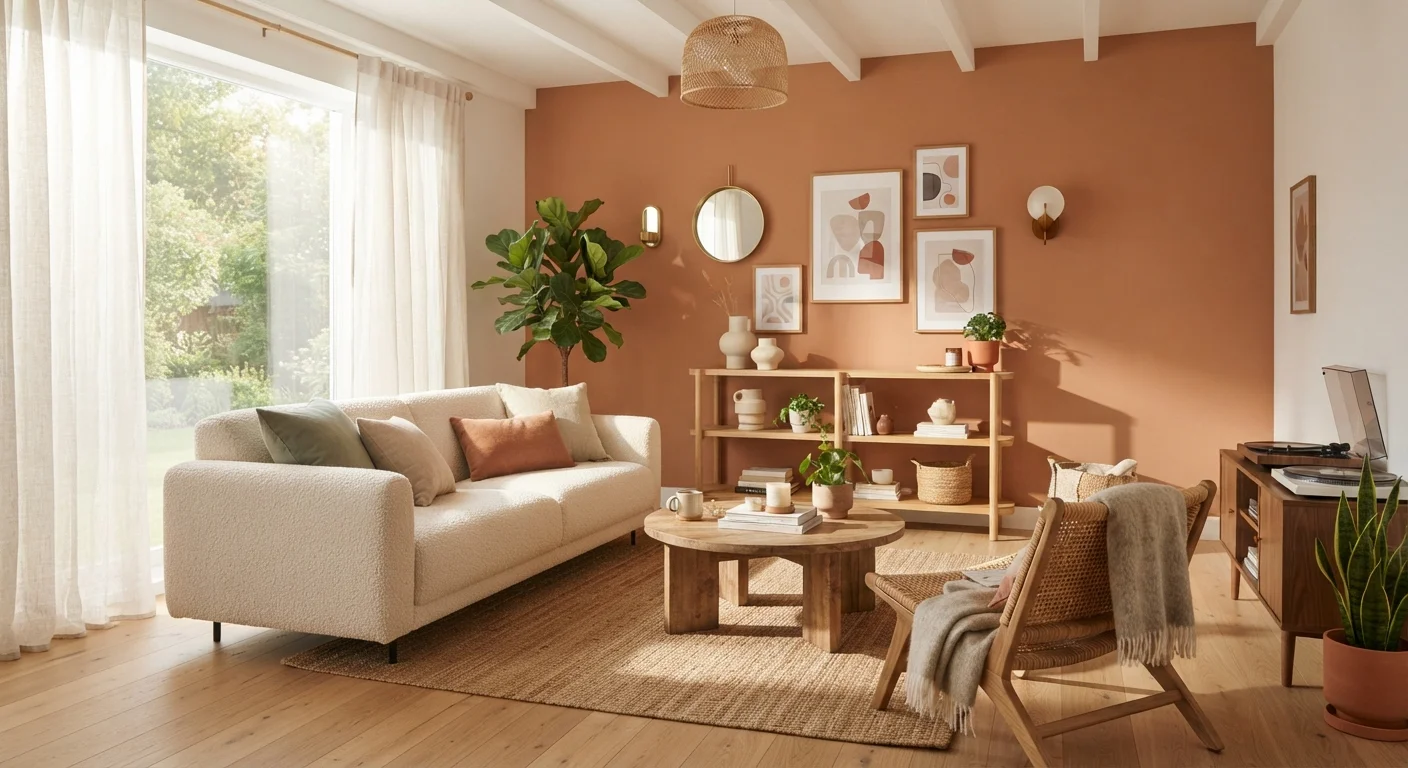
The Foundations of Colour Theory
Colour theory is the framework designers use to understand how colours relate to and interact with one another. For homeowners, it translates abstract art-school concepts into practical tools for choosing palettes with confidence. At its core, the traditional colour wheel — organised into primary (red, yellow, blue), secondary (green, orange, violet), and tertiary colours — maps the relationships between hues and reveals which combinations tend to feel harmonious or dynamic.
Understanding these relationships is the starting point for any colour decision inside the home. Colours that sit opposite each other on the wheel are called complementary pairs — they create high contrast and visual energy. Colours adjacent to one another are analogous — they blend smoothly and evoke a sense of calm cohesion. For a deeper grounding in how these principles interact with broader design decisions, see our guide on the design principles behind rooms that feel right.
90%
Snap judgments influenced by colour alone
Research cited in colour psychology literature suggests up to 90% of initial product and environment assessments are based on colour.
60–30–10
Designer's colour proportion rule
Interior designers commonly use this split — 60% dominant, 30% secondary, 10% accent — as a baseline for balanced room palettes.
3–5
Recommended paint test swatches per room
Most design professionals recommend testing at least three to five candidate colours per room before making a final decision.
Understanding Hue, Saturation, and Value
Every colour can be described using three properties:
- Hue is the pure colour itself — what we mean when we say something is red, green, or blue.
- Saturation (also called chroma) refers to the intensity or vividness of a colour. A highly saturated red is bold and energetic; a desaturated version shifts toward muted rose or dusty brick.
- Value describes lightness or darkness on a scale from white to black. A high-value colour is pale (think blush); a low-value colour is deep (think burgundy).
In practice, most interior colour mistakes come from misreading saturation and value rather than hue. Two greens that share a hue can feel entirely different once one is muted and dark and the other is bright and pale. When you look at paint chips, train yourself to assess all three dimensions — not just the name on the label.
When comparing paint samples, always fold the chip so the pure white border is hidden — that white edge artificially lightens your perception of the colour's true value.
The white border creates a simultaneous contrast effect that makes every colour look lighter and brighter than it will appear on an actual wall surrounded by other elements.
If a colour looks perfect on the chip but wrong on the wall, try adjusting the sheen level before changing the colour — a flat finish absorbs light and reads darker; a satin finish reflects it and reads lighter.
Sheen affects how a surface interacts with light, which in turn changes the apparent hue, saturation, and value of the same paint formula.
To unify a multi-room open-plan space, choose one consistent trim and ceiling colour and vary only the wall hue from room to room — this creates rhythm without monotony.
Fixed architectural elements like trim and ceilings act as neutral connective tissue; keeping them constant lets wall colours shift without the transitions feeling disjointed.
Warm vs. Cool Colour Temperature
Colour temperature describes the psychological warmth or coolness a colour projects, independent of its hue. Reds, oranges, yellows, and warm neutrals (those with beige or yellow undertones) are considered warm. Blues, greens, purples, and cool neutrals (those with grey or lavender undertones) are cool.
Temperature has a direct effect on perceived space. Warm colours advance — they appear to bring walls closer, making a room feel more intimate and cosy. Cool colours recede — they push surfaces back, lending an airy, open quality to a room. This is a useful tool when you want to visually reshape a space without structural changes.
Temperature also affects how colours interact with one another. Mixing a warm and a cool colour in the same room can feel jarring unless the values are balanced or a bridge neutral is introduced. For guidance on choosing wall colours with specific undertones, our article on warm vs. cool neutrals and undertones covers this in detail.
Bridge Warm and Cool Colours with Neutrals
When your room has both warm and cool elements — such as warm wood flooring and cool blue walls — introduce a greyed or earthy neutral in a mid-scale element like a rug or sofa. This acts as a visual bridge, reducing tension between the temperature extremes without eliminating the contrast.
Building a Colour Scheme
A reliable interior colour scheme typically follows a simple proportion rule: roughly 60% dominant colour (usually walls and large furnishings), 30% secondary colour (upholstery, rugs, drapery), and 10% accent colour (cushions, artwork, accessories). This prevents any single colour from overwhelming the space while still giving it character.
Common scheme types include:
- Monochromatic: variations of a single hue in different values and saturations. Creates sophistication and calm.
- Analogous: two to four neighbouring hues on the colour wheel. Feels natural and harmonious — think forest greens paired with warm sage and ochre.
- Complementary: opposite hues used together. High contrast and visually energetic — requires careful balancing of saturation to avoid clashing.
- Split-complementary: one hue paired with the two colours flanking its complement. Offers contrast with slightly less tension than a direct complement.
If you're new to decorating and uncertain where to begin, our guide to decorating your first home offers a grounded starting framework.
How Light Transforms Colour
Light is perhaps the single greatest variable in how a colour reads in a real room. The same paint chip can look warm and inviting in a south-facing room flooded with afternoon sun, and flat or even greenish in a north-facing room under cool, indirect daylight.
Natural light changes across the day: morning light skews warm and golden, midday light is neutral and bright, and late afternoon light becomes amber. Artificial light adds another layer — incandescent and warm-LED sources shift colours toward yellow and orange; cool-white LEDs push them blue-grey.
Always test paint samples in swatches of at least 12 by 12 inches, observing them at different times of day and under your actual artificial lighting. Understanding how layered lighting interacts with colour is also crucial — our article on getting interior lighting right explains the three-layer approach designers use.
North-Facing Rooms Need Special Attention
In North America, north-facing rooms receive the least direct sunlight and tend to cast a cool, bluish light throughout the day. Cool-toned colours can appear grey or dull in these conditions. Warm neutrals, ochres, and soft terracottas typically hold up better. Always observe your test swatches under the room's actual conditions before committing.
Applying Colour Room by Room
Different rooms have different functional demands, and colour choices should reflect both the mood you want to create and how the space is used:
- Living rooms benefit from flexible, welcoming palettes. Warm neutrals anchored by one intentional accent colour tend to perform well across varied lighting and furnishing styles.
- Bedrooms generally favour lower saturation and cooler or muted tones that promote rest. Deep, enveloping tones can also work beautifully when value is managed carefully.
- Kitchens tolerate brighter, more saturated colours because they are active, task-oriented spaces. Contrast between cabinetry and wall colour adds definition and energy.
- Bathrooms are ideal candidates for bold or dramatic choices — the small square footage limits commitment, and natural light from windows can amplify colour.
- Hallways and transitional spaces should echo the colours of adjacent rooms to create visual flow rather than abrupt shifts.
For a broader vocabulary of the design terms you'll encounter as you plan, the interior design terminology reference is a useful companion.
Start with What You Cannot Change
Before selecting any paint colour, identify and document the fixed elements in your room: flooring material and tone, built-in cabinetry, tile, and any large upholstered pieces you plan to keep. Every colour decision should respond to these anchors. Choosing paint first and hoping furnishings will eventually align is the most reliable route to costly repaints.
Common Mistakes and How to Avoid Them
Even experienced decorators fall into predictable traps when working with colour. Here are the most common and how to sidestep them:
- Choosing paint colour first. Always start with fixed elements you can't easily change — flooring, cabinetry, existing upholstery — and build your palette around those anchors.
- Relying on paint chips alone. Chips are tiny and viewed under store lighting. Print large samples or use peel-and-stick testers applied directly to your walls.
- Ignoring the ceiling and trim. A wall colour reads differently against bright white trim versus warm off-white or tinted trim. Ceilings in a slightly lighter value of the wall colour can feel intentional rather than forgotten.
- Over-saturating every surface. When every element competes at full intensity, the eye has nowhere to rest. Introduce lower-saturation versions of your accent colour in larger-area applications.
- Forgetting the 60-30-10 rule. Without a proportion structure, rooms tend toward visual noise or, conversely, feel directionless and flat.
Avoid Committing Before Testing at Scale
Purchasing a full gallon and painting an entire wall before testing a large sample is one of the most common — and costly — colour mistakes. Paint at least a 12-by-24-inch patch directly on the wall, observe it over 24–48 hours across morning, afternoon, and evening light, then decide. Most paint retailers offer small sample quantities specifically for this purpose.
The content on this site is for informational purposes only and is not a substitute for professional advice. Always consult a qualified professional for guidance specific to your situation.