

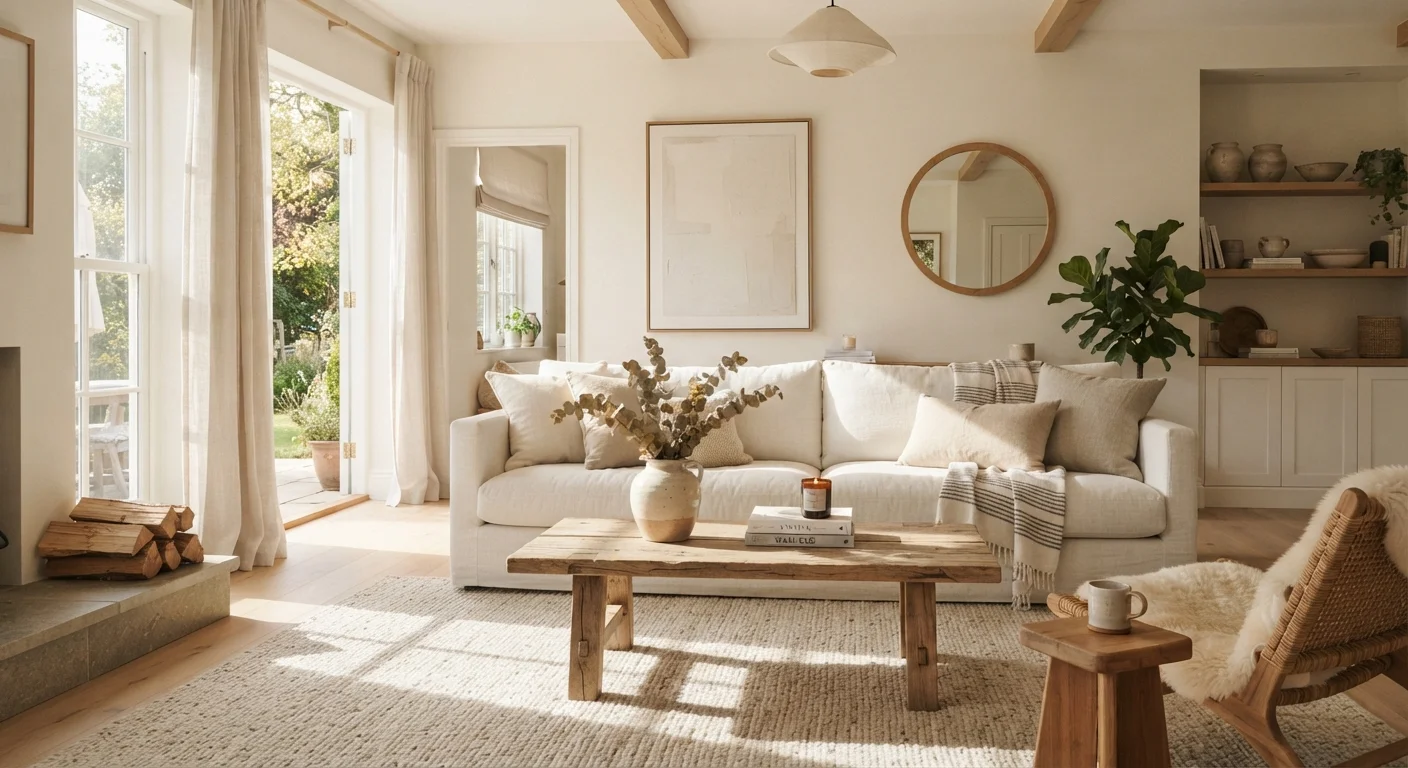
Why White Interiors Get Misunderstood
White is one of the most-used interior colors in American homes — and one of the most misunderstood. Its reputation for being simple, safe, and endlessly versatile has given rise to a set of persistent myths that lead homeowners in the wrong direction. The result is often the very thing they were trying to avoid: a room that feels cold, clinical, or uncomfortably bright.
Understanding what actually makes white work — and what gets in the way — starts with dispelling the misconceptions that shape most design decisions from the paint chip stage onward. For a deeper foundation in how color properties interact in interior spaces, this complete color reference covers hue, value, and temperature in practical terms.
Myth
White is white — any shade will work the same way.
Fact
Whites vary enormously by undertone; the wrong one can cast pink, yellow, green, or grey hues across an entire room.
Paint manufacturers offer hundreds of distinct whites, and the differences are not cosmetic. A white with a pink undertone reads rosy on large surfaces. One with a yellow undertone turns buttery under warm light — sometimes pleasantly, sometimes not. Understanding undertones is the single most critical skill in choosing a white, and it requires comparing samples on your specific walls, in your specific light, against your existing furnishings.
Myth
White interiors are easier to maintain than colored ones.
Fact
White shows fingerprints, dust, scuffs, and stains more visibly than most mid-tone colors, requiring more frequent cleaning.
The idea that white is a low-effort choice is one of the most practically costly myths in interior design. Bright white walls highlight every handprint near a doorway, every smudge behind a sofa, and every nick in the baseboard. White upholstery and rugs demand regular, diligent care. This doesn't disqualify white as a choice — but it should factor into the decision, particularly in high-traffic areas or households with children and pets.
Myth
A white room will always feel bright and airy.
Fact
Without adequate natural light and thoughtful material layering, a white room can feel cold, flat, and clinical.
Light is the variable that makes or breaks a white interior. In a north-facing room with few windows, white walls can look dull or even oppressive. The perception of brightness comes from reflected light — and if there isn't enough light to reflect, the result is a washed-out, sterile space. Warm-toned whites, strategic mirror placement, and layered artificial lighting all help, but they cannot fully substitute for natural daylight.
Myth
All-white means you don't need to think about texture or layering.
Fact
Texture is the primary design tool that keeps white interiors from looking flat — it is more important in white rooms than in colorful ones.
In rooms with saturated colors, visual interest comes partly from hue contrast. In white rooms, that contrast disappears — meaning texture, finish variation, and material depth must do the heavy lifting. Linen against smooth plaster, matte against gloss, rough wood against clean cotton: these contrasts give the eye something to move between. Without them, a white room registers as blank rather than calm.
Myth
White automatically makes a small room feel larger.
Fact
White can help a room read as more open, but furniture scale, ceiling height, and natural light have an equal or greater effect on perceived space.
White does have a documented tendency to reduce the apparent weight of walls and make boundaries feel less imposing. But a small room filled with oversized furniture, blocked windows, or a low ceiling will still feel cramped regardless of wall color. White is a supporting tool in the spatial equation — not the only variable. Addressing furniture scale and light exposure alongside paint choice produces far better results than paint alone.
Making White Work: Practical Considerations
Once the myths are out of the way, the real work of designing a successful white interior becomes clearer. The most effective white rooms don't rely on a single white — they layer several tones across walls, trim, ceiling, and furnishings, each with slightly varied undertones and finishes. A flat matte wall paired with a satin-finish trim and a creamy linen sofa creates depth that a single-note white scheme never will.
Don't Skip the Sample Step With White
White is one of the most light-sensitive color categories — a shade that looks clean and neutral on a small paint chip can read entirely differently once it covers a full wall. Always apply large test swatches directly on your wall and observe them at multiple times of day before purchasing full quantities. What appears bright white in the store may shift noticeably in your home's specific light conditions.
Lighting deserves particular attention. A north-facing room with limited daylight will shift almost any white toward blue or grey, while warm incandescent or LED bulbs pull out yellow and cream undertones. Test your chosen white under both natural and artificial light at different times of day before committing. If undertone reading is new territory for you, this guide to warm versus cool neutrals walks through exactly how to identify and compare them.
Finally, if the concern driving a white interior is the feeling of spaciousness, it helps to know that other factors carry equal weight. Furniture scale, ceiling height, and natural light all play major roles — explored in detail in this breakdown of why rooms feel smaller than they are. White alone is not a spatial cure-all, but paired with the right conditions, it genuinely earns its reputation.
40%+
Of US homeowners choose white or off-white as their primary wall color
White and near-white tones consistently rank among the most selected interior paint colors in annual design surveys, reflecting their enduring appeal and versatility.
3–5
Paint samples recommended before committing to a white
Interior designers commonly advise testing multiple white samples on the actual wall surface and observing them across different times of day before making a final color decision.
The content on this site is for informational purposes only and is not a substitute for professional advice. Always consult a qualified professional for guidance specific to your situation.